Clik here to view.

Back in 2011, I was brainstorming ideas for future projects with local historian Stephen Otto. He was intrigued by what the BBC and New York Times had both published at the time: lists of important, historic objects that helped define a place. We surmised that compiling a list for Toronto would be an entertaining and revealing project.
Five years later, and with over 300 objects identified with the help of over 50 local know-it-alls, we had our list: 50 Objects That Define Toronto would become Spacing’s first published book, which would subsequently be turned into a five-part television series.
This deep dive into finding the objects led me to Wayne Reeves, the Chief Curator of the City of Toronto’s museum collections. The long hours in which Wayne allowed me to photograph these items at the City’s warehouse storage facilities gave me great insight into the variety and vast amount of objects within the collection (over 150,000!). But I was more than just curious about these products; I was completely smitten by them.
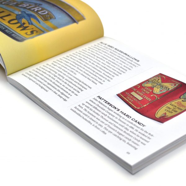
As a graphic designer who often specializes in product design, I became enthralled by the packaging of a cough syrup remedy, for instance, and absolutely charmed at the craftsmanship: the hand lettering, the use of colour, the range of typography. Soon enough, I realized much of the design of the products and their packaging were created in Toronto, by Torontonians, to be used and consumed by Torontonians.
The germ for Packaged Toronto was planted.
Image may be NSFW.
Clik here to view.
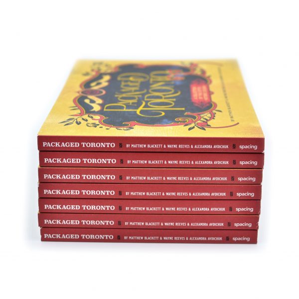
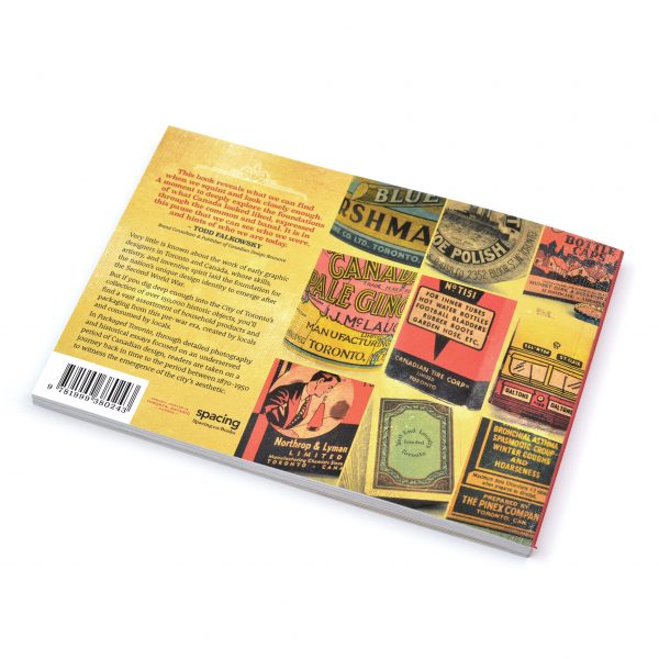
Branded containers can reveal much about the interplay between products, packaging materials, and package design. They’re also a partnership between designers, manufacturers, retailers, and consumers. Packaged Toronto is a tribute to three-dimensional graphic design, viewed through the lens of a single city as it became Canada’s commercial and industrial powerhouse.
Most of the products in this book date from the 1890s to 1950, the age of factory smokestacks, mass manufacturing, lithographed tin canisters, and paper boxes. A few objects —crudely stamped stoneware — are earlier. A few are later, but among them you won’t find bar codes, nutrition panels, or stand-up plastic pouches. Many of the products themselves have become obsolete, either due to changing styles and tastes or because of technological advancements.
Image may be NSFW.
Clik here to view.
Currently, the post-Second World War era of modern Canadian graphic design is having a much-deserved moment in the cultural spotlight that highlights the emergence of the nation’s design aesthetic and newfound confidence as it approached the country’s Centennial in 1967. But, as the objects in this book can attest, regional and national approaches to graphic design existed in Canada long before any of the world wars, though mostly overlooked by designers and historians alike.
The collection of charming objects in Packaged Toronto is accompanied by corporate stories or personal profiles that, until now, were either little-known or forgotten. The graphic designers tied to these products and producers often remain obscure. Thankfully, contextual profiles and essays by Wayne Reeves, Alex Avdichuk, Dave LeBlanc, Jamie Bradburn, Brian Donnelly, Carl Shura, and Bonne Zabolotney help address this amnesia. Packaged Toronto is our attempt to help fill the missing gaps of local and Canadian graphic design history.
LINK: VISIT THE SPACING STORE TO BUY THE BOOK
Image may be NSFW.
Clik here to view.
The post NEW SPACING BOOK: ‘Packaged Toronto’ and the emergence of the city’s design aesthetic appeared first on Spacing Toronto.